
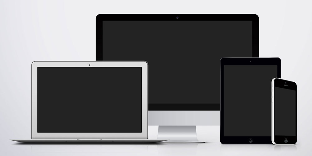
With so many different devices out there between desktops, tablets, and phones, responsive web design is more important than ever. Responsive web design takes web design and development to a whole new level. New devices with different screen sizes and orientations are being created every day. It’s important to think about screen size, orientation, image resolution, platform, and ease of use. You need to think about if the theme you’re using is responsive or not. Designing a custom design for each type of device would be a tedious and overwhelming task. Instead, it’s important to plan out one design that will scale and transition smoothly between the different devices. The easiest way to do this is to start building your site for mobile devices first.

Mobile First Design
The concept behind mobile first design is to build a full and visually appealing site for smaller screens first, then add features and content for bigger screens and larger devices. This is also known as progressive enhancement. This process is all about prioritization. It may take a little longer to implement but it’ll help you focus on what the most important pieces of your website are and how to focus on those pieces and display them across all devices. Mobile web sites should uses minimal screen space, processing power, and plugins to and provide a great and functional experience for users.
Responsive Images
When adding images to your webpage you want to make sure you keep in mind how these images are going to look on all device types. To make an image responsive you can set the maximum width of that image to 100%. This will set the image to 100% of the screen so that the image will scale down if it has to but never scale up to be larger than its original size and look distorted. You also want to think about image resolution. Depending on the size of the image, it may look good on smaller devices but pixelated on larger devices. It’s important that the image is properly optimized so that it is displays well on all devices.

Responsive Themes
There are many responsive themes out there that can help you through this process. Most responsive themes will display your content in a grid type layout. For example, you might have a slider at the top of your site followed by four side-by-side blocks below, and below that, three side-by-side blocks. The idea behind a grid layout is that as your screen size gets smaller and smaller, each section’s layout will adapt to the screen’s width, adjusting the original view of the layout. So on a tablet, your slider will scale down, your four side-by-side blocks will turn into two sets of two side-by-side blocks, and you three side-by-side block might turn into three separate grids, one stacked on top of the other.
Most responsive themes provide your site with an array of responsive layout options. You can choose whether or not you want to display your sidebar on the left side or right side of your content. You can also add in header and footer elements but you have to take into consideration how each of these layout options will effect your site. For example, if you decide to have a left sidebar instead of a right sidebar, your sidebar content will display above your page content on tablet and mobile devices. Usually having a right sidebar is the better option because you’ll want to display your page content first, since that will contain your most important information first.
As your screen gets smaller and smaller or viewed through different devices, your navigation menu will also get smaller with it. It gets to a point where either your menu is to small to read or overlaps onto other header elements, like your logo. Many sites rely on drop-down menus. Since drop-downs rely on mouse hovering, they don’t work well on mobile and touch devices. Responsive themes help fix this issue by adding a mobile menu option to your site. When your site starts to scale down, your responsive theme will hide the desktop version of the navigation menu and display the mobile version of the menu. The mobile menu will, in most cases, create a three-lined mobile menu button (sometimes referred to as a hamburger menu) that users can click to bring a fade in or slide out menu (from the left, right, top or bottom). This option provides your menu with a clean and responsive look, making it easy to navigated through on smaller devices.
Be Responsive
With more and more users using different kinds of devices to browse the web, it’s important to make sure your site is responsive. It’s best to design your site with a responsive theme taking the mobile first design approach. Your site will benefit from it by providing your most important content to your users and be easy to navigate through multiple devices.